
- CM DESIGN SOLUTIONS

- Feb 4, 2021
- 7 min read
Updated: Feb 6, 2021
2020 was one of the hardest years that we have faced and most likely will face in our life times and was a year of sacrifice for all. It would be easy to focus on only the negative aspects of the year and see it as a complete disaster.
Towards the end of 2020 I reflected on some of the events that had occurred and created visuals which aimed to focus on some of the positive aspects of the year. In addition to this I created some thought provoking images which were made in an effort to shift perspectives and change perceptions.
Negativity was and is still prevalent throughout TV and social media and positivity needs to be spread at a time where more and more people are taken victim to mental health issues.
1. 'Captain Sir Tom Moore - We salute you'
Sir Captain Tom Moore, needs no introduction and became a celebrity overnight with his tremendous fund raising effort for the NHS, raising approx. £32m (Metro). The below are commemorative posters which celebrate his Military background, character and tremendous effort. The combined medals make a great backdrop for the piece and the sky blue gradient represents positivity and a sign of better days to come. Poster 3 utilises the official NHS blue Hue #005EB8.


#2020#rip#sirtommoore#spreadpositivitynotcovid#captaintom#captaintommoore#captaintom#32million#nhs#nhsheroes#covid19#covidartmuseum#sirtommoore#gallery#museum#graphicdesign#design#art#illustration#graphicdesigner#logo#branding#graphic#designer#digitalart#illustrator#photoshop#creative#artwork#artist#typography#graphics#logodesigner
2. 'George Floyd - Catalyst for change'
George Floyd tragically lost his life following the merciless killing by Derek Chauvin in broad daylight in Minneapolis, Minnesota (USA) on 25th May 2020. This triggered a Global movement and his murder was very much the catalyst for change. Whilst the negative aspect is that a man lost his life and people are killed every day, this event helped the world gain traction in making movements for the BAME community, which is a positive which came out of this situation. This poster visually depicts the turning of a corner and a step up from the world as we knew it.


#2020#blacklivesmatter#icantbreathe2020#GeorgeFloyd#blackexcellence#melanin#BAME#black#blackisbeautiful#melaninpoppin#art#blackbusiness#blm#graphicdesign#design#art#illustration#graphicdesigner#branding#graphic#designer#digitalart#illustrator#creative#artwork#artist#typography#graphics#marketing#drawing#designinspiration #bhfyp
3. 'The good, the bad and the ugly'
Many people were happy to leave 2020 behind and had been praying for 2021 for many months. As the Global pandemic continued, much of 2020 was a blur and we entered a new year. I created a trio of '2021 typography' which I have entitled 'The good, the bad and the ugly'. Many of us are in similar situations but what can differ are people's mindsets. How does your 2021 look? I like to believe that a positive outlook leads to positive outcomes.


#2020##spreadpositivitynotcovid#covidartmuseum#2021#graphicdesign#design#art#illustration#graphicdesigner#logo#branding#graphic#designer#digitalart#illustrator#photoshop#creative#artwork#artist#typography#graphics#logodesigner#marketing#drawing#logodesign#designinspiration#adobe#brand#vector#love#bhfyp
4. '1st World vs 3rd World'
Sometimes when I think I'm in a bad situation I have to take a step back and put things into perspective. 2020 was a particularly bad year for many in terms of health, bereavement, financial struggle, not to mention loneliness and mental health problems. These struggles continued into 2021.
For many of us, if we look at the bigger picture and realise that while we have had a nightmare year or so, our reality is paradise in contrast with 3rd world countries which would love to live the lives that we live every day.
We will recover from the craziness of 2020 and beyond, however millions of people less fortunate than ourselves will not. They will be in a perpetual nightmare but they will remain grateful for the little that they have. This is something which I always think about when putting my feet up in front of the TV or climbing into bed at night. Gratitude for what you have is a must.


#spiltmilk#1stworld#3rdworld#milk#bottle#baby#silverspoon#2020#infinity#graphicdesign#design#art#illustration#graphicdesigner#logo#branding#graphic#designer#digitalart#illustrator#photoshop#creative#artwork#artist#typography#graphics#logodesigner#bhfyp
5. 'Spread positivity not Covid'
Created on New Years Eve 2020, 'Spread positivity not Covid' is a phrase and hashtag which I used in the creation of the below pieces. The initial poster shows dark and stormy times with a light at the end of the tunnel in the form of the year 2021. 2020 looked bleak in many aspects but having something to look forward to or something to give hope for the future helps you to remain positive. The dark was transformed into blue keeping with the project theme. The typography was also utilised on a number of mockup designs to showcase their potential use in campaigns.


#2020#snapback#covid#2021#blue#hat#spreadpositivitynotcovid#spreadlove#positivevibes#covid_19#covidcampaign#covidartmuseum#pinbadge#badge#billboard#covidposter#uniproject#lovingtheconcept#totebag
6. 'Stay Home'
'Stay Home' is a message that has been spread far and wide in a bid to protect the NHS and save lives. For this reason I decided to create a logo twist of my own based on a Superman theme.


Design
The design utilises the Superman emblem rotated 180 degrees, embezelled with a heart and 'S' representative of 'Stay' and the Super effort and warm hearts of the nation. The 'H' represents 'Home' and also references the 'H' of hospital signs in a subtle warning to stay home to ensure you do not end up there. Further inspiration and reference points can be seen below the design. Overall I was very pleased with this piece which was fun but with a serious message.


Other design inspiration....


#stayhome#superman#nhs#savelives#graphicdesign#design#art#illustration#graphicdesigner#logo#branding#graphic#designer#digitalart#illustrator#creative#artwork#typography#graphics#logodesigner#photography#marketing#drawing#logodesign#designinspiration#adobe#brand#vector#love#bhfyp
7. 'I love lockdown'
'I Love lockdown' was my way of looking for the positives in being stuck in lockdown for a 3rd time. Having asked my social media following to provide positive words for 2020, some of these words were used on the poster to showcase several reasons why we can remain positive during lockdown. It was great to see audience participation and that others were also able to be positive during this difficult time.


Inspired by Paul Rand's famous 'IBM' rebus poster and the Milton Glaser classic 'I Love NY' poster.


#2020#ilovelockdown#eyelovelockdown#spreadpositivitynotcovid#spreadlove#positivevibes#covid_19#covidcampaign#covidartmuseum#covidposter#uniproject#lovingtheconcept#paulrandinspired#eyelovenewyork#bonding#newborn#perfect#opportunity#reflective#educational#enlightening#time #reflection#time#birth#closeness#blessed#solidarity#adapt#contentment
8. 'NHS Gratitude'
The NHS (National Health Service) is filled with incredible people who save lives on a daily basis. These people have risked life and limb to take care of others and attempt to gain a handle on the Global pandemic. Although many people have lost their lives, their efforts should still be appreciated and commended as many would not be willing to put themselves in harms way.
Research
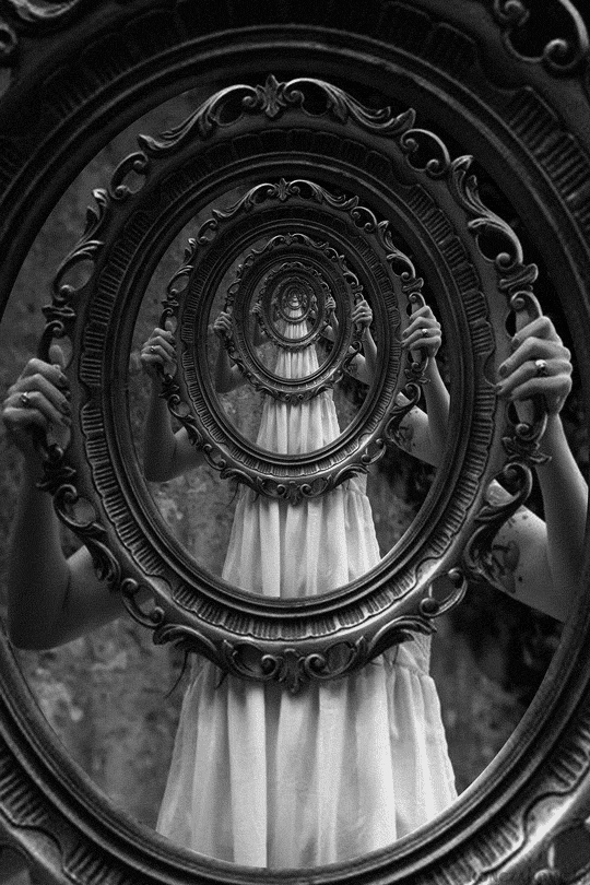
The concept of a frame came with research into infinite zoom images in which a person holds a frame, the frame contains the entirety of the image and this continues infinitely (example below). it was a fun concept to work with and I think a great metaphor for perpetual gratitude.
Design
In these dark and stormy times the innocence of children can bring us joy. This piece visualises perpetual gratitude for the NHS and everything that they do for us. The rainbow that brings hope to everyone. Heroes throughout the pandemic and they will be heroes afterwards. The concept was created as a video rather than a GIF in an attempt to keep optimal colouring and quality where possible.


#2020#savelives#graphicdesign#design#art#illustration#graphicdesigner#logo#branding#graphic#designer#digitalart#illustrator#creative#artwork#typography#graphics#logodesigner#photography#marketing#drawing#logodesign#designinspiration#adobe#brand#vector#love#bhfyp#gratitude#rainbow
9. 'Is it worth it?'
'Is it worth it?' An optical illusion based on our current situation in the UK. Another perspective piece. We rose through the tiers straight through to lockdown but we are in control of what happens next.
Will the next step tip us over the edge or will it be a step back down?? Turn your phone to the left to see the illusion more clearly (you may need to adjust your eyes). For all the pain and sacrifice that we've all endured is it worth remaining complacent? Or is it worth being selfless in the pursuit of future freedom? Only you can decide that....

#2020#spreadpositivitynotcovid#covidartmuseum#lockdown#tiers#covid19#graphicdesign#design#art#illustration#graphicdesigner#branding#graphic#designer#digitalart#illustrator#photoshop#creative#artwork#artist#typography#graphics#logodesigner#marketing#drawing#logodesign#designinspiration#brand#vector#love#bhfyp
10. 'Glass half empty, glass half full?'
'Glass half empty, Glass half full'. How we see the world can be determined by our own mindset. Perception is a conscious choice. If you look at a situation negatively (glass half empty) then it will become negative through pessimist views. If you look at a situation positively (glass half full) then it will become a positive through optimistic views. We can determine our own reality. I personally try to be a glass half full (optimist) where possible and took 2020 as a time for reflection and used it to help try and put my world into perspective.
The concept utilises deconstructed text and elements designed around the empty/full concept with background colouring intertwining the good/bad theme of the whole project.
Which one are you?

#2020#graphicdesign#design#art#illustration#graphicdesigner#logo#branding#graphic#designer#digitalart#illustrator#photoshop#creative#artwork#artist#typography#graphics#logodesigner#photography#marketing#drawing#logodesign#dise#designinspiration#webdesign#adobe#brand #vector #love #bhfyp
11. 'Blue pill/Red pill'
"Morpheus: “You take the blue pill, the story ends, you wake up in your bed and believe whatever you want to believe. You take the red pill, you stay in wonderland, and I show you how deep the rabbit hole goes."
–The Matrix" (Sparknotes.com)
In many ways 2020 seemed like it wasn't real. Maybe even like a glitch in the matrix. If the matrix was real, which pill would you take? Many might say blue due to the many sacrifices and tragedies of 2020. Others may say red as 2020 brought them personal growth and made them appreciate life more, not taking everything that we had prior to the pandemic for granted. If only such choices were real hey! It would be a hard decision that's for sure!
This design is simple but visually appealing, with a carefully executed typography layout, combined with deconstructed text for the Blue/Red text focal points. Another blue/red custom gradient has been added indicative of a blurred line between fiction and reality.

#2020#bluepillredpill#morpheus#redpillbluepill#matrix#2020#spreadpositivitynotcovid#growth#gratitude#globalpandemic#COVID19#graphicdesign#design#art#illustration#graphicdesigner#logo#branding#graphic#designer#digitalart#illustrator#photoshop#creative#artwork#artist#typography#graphics#logodesigner#photography#marketing#drawing#logodesign#dise#designinspiration#webdesign#adobe#brand #vector #love #bhfyp
12. '2020 a long year. 2021 the year of hope'
After a long drawn out 2020, we transitioned into 2021 but the virus is still spreading fast! let's hope that science prevails and we can get back to some level of normality in 2021 with cov-19 ensuing in battle with the vaccines worldwide. Even if the vaccine is not at the forefront of everyone's mind, let's all be thankful that we were able to make it to 2021. And for those that were not so fortunate, rest in peace.
The below is my visual representation of my above sentiments. Firstly focused on just the lengthy year of struggle and then a focus on the improvement. The '0' elongates to become a '1' following the transition from 2020 - 2021.

additional combined elements below represent the ensuing battle which was mentioned in the earlier description.

#2020#virus#COVID19#hopeforthefuture#graphicdesign#design#art#illustration#graphicdesigner#logo#branding#graphic#designer#digitalart#illustrator#photoshop#creative#artwork#artist#typography#graphics#logodesigner#photography#marketing#drawing#logodesign#dise#designinspiration#webdesign#adobe#brand #vector #love #bhfyp
Thank you for reading! :) If you would like to see more then please feel free to browse the site.
Much Love
Corey